Fitbox: Fitness Site Redesign & Membership Plugin


A minimal remodel built for clarity, conversion, and seamless membership.
How do you strip a site back to its essentials, removing the noise, without removing what makes the brand?
Fitbox needed a remodel that matched their direct, no-frills ethos. Cleaner design, sharper copy, and a frictionless path to membership purchases, all without rebuilding the infrastructure their existing provider already handled.
The problem
The site was working against the brand, and the systems behind it could not be touched.
Fitbox sells directness. Turn up, train, leave. The website was doing the opposite, asking members to read more, click more and decide more before they could do the one thing they came to do.
A cluttered site for a brand whose entire proposition is the absence of clutter.
Members had to leave the site to buy credits or apply for a membership.
The membership and credit infrastructure sat with an existing provider, and it was not going anywhere.
So a rebuild was never on the table. Whatever we did had to work with what was already running.
Every step between wanting to train and being able to pay for it was costing sign-ups.

- 01Website Redesign
- 02UI / UX Design
- 03Custom Plugin Development
- 04Membership & Credit Integration
- 05Performance Optimisation
- 01Website Redesign
- 02UI / UX Design
- 03Custom Plugin Development
- 04Membership & Credit Integration
- 05Performance Optimisation



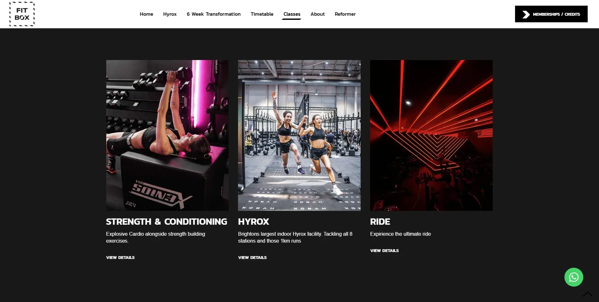
Minimal by design. Direct by intention.
A site that works as hard as your members do.
Start the journey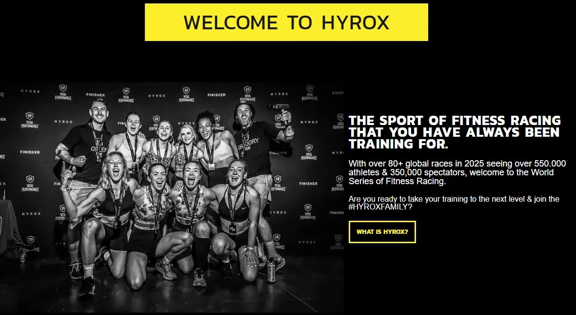


Seamless Membership
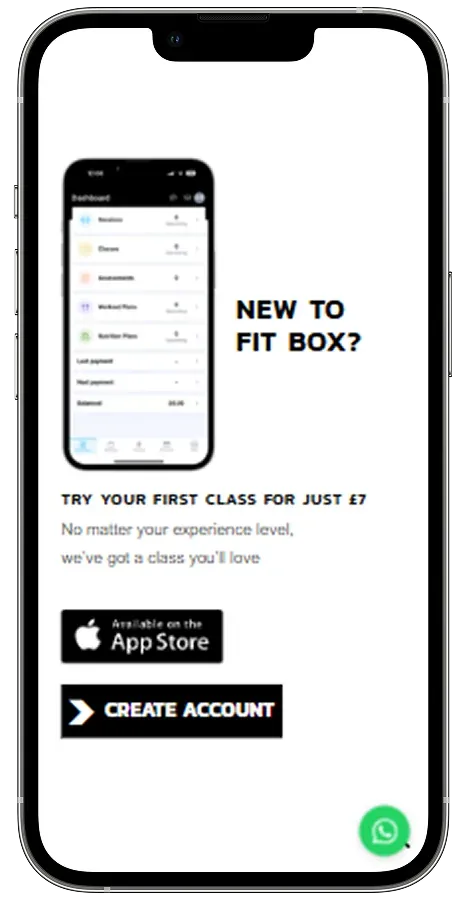
A custom-built plugin connecting the site directly to Fitbox's existing membership provider, making credit purchases and membership applications effortless, without disrupting the systems already in place.
What changed
Less site, more members.
Before
A site that said more and meant less
Members sent elsewhere to buy credits
A visible seam between two systems
A rebuild nobody wanted to fund
After
Every page doing one job
Credits and memberships bought on the site itself
One journey, with the provider still handling what it always did
A redesign that left the working infrastructure alone
The outcome
Stripped back. Sharpened up.
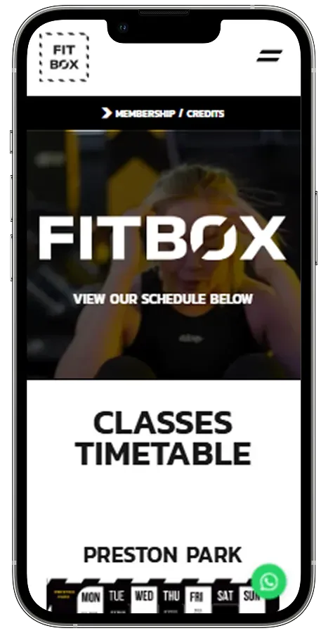
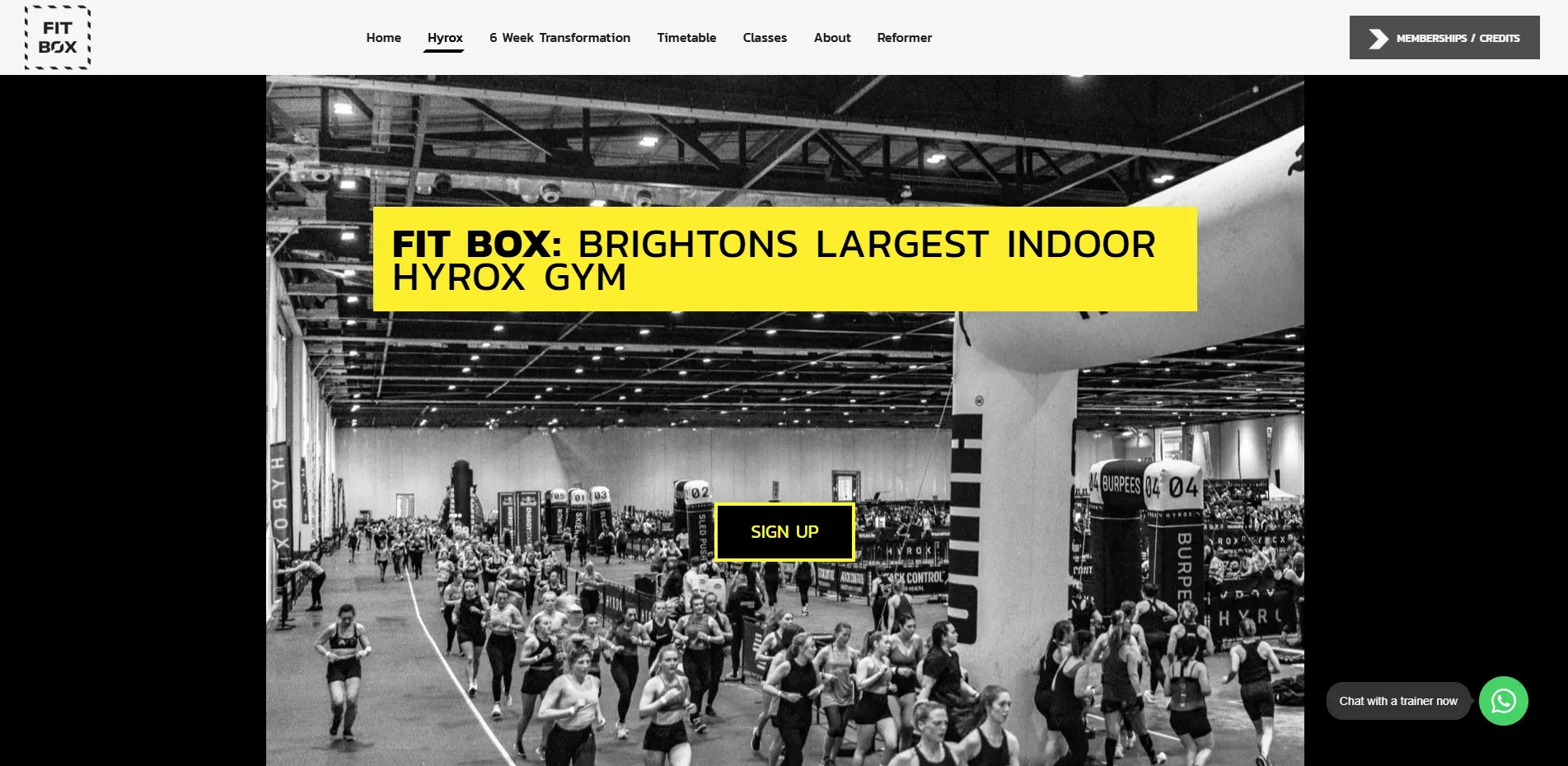
We completed a full remodel of the Fitbox website, moving from a cluttered experience to something minimal, direct, and purposeful, a digital presence that matches the discipline of the brand itself.
The redesign centred on removing friction at every stage: cleaner navigation, stronger hierarchy, and a visual language that lets the offering speak without distraction.
Alongside the redesign, we built a custom plugin to bridge the site with Fitbox's existing membership provider. Members can now apply for memberships and purchase credits directly through the site, with the transaction handled through the provider they already trust.
The result is a tighter, more confident digital presence: one that converts without complexity.
Start the conversation
Let's discuss your project.
Share your goals and challenges. We'll respond within one working day.
What happens next
We'll review your message and respond within one working day.
We'll arrange a short call to understand your goals.
You'll receive a clear recommendation, not a generic proposal.
Work that
speaks for itself.
Every project is built with precision. See what we've delivered for businesses like yours.
See our other work